Saturday, 9 July 2016

Roman Temple Breakdown

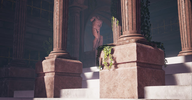
I was browsing artstation as you do and I came across some screenshots from Ryse Son of Rome. Considering I only own a PS4 I've never the means to play it due to its Xbox exclusivity. What a great looking game. It inspired my next project to create a Roman temple.


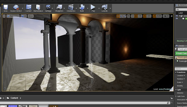
I started simply enough, modeling pillars and archways. Headed into engine and started to see how everything worked then produced a tileable floor. I really wasn't into how it looked with too much contrast and noise so I started again.


Basic block out and lighting setup.


The new marble floor. Way less things going on. Sometimes simple is better.


Textured the pillars and archways in Substance. Messed around with the post processing for lighting.


Figured I was lacking in actual assets so I produced this gold pattern ceiling and concrete slabs in Substance Designer.


While the ceiling looked nice it was wayyyy too busy again so I had no knock down the brightness to balance the values.


A little bit of the outside was created with a landscape and a few rock meshes.The floor was done in Substance Designer and blended between rocks and a material with no rough value so it looked like water puddles.


I attempted to sculpt a body for a statue. I am in no way a character artist so this was particularly difficult. I used a statue of Hercules and photoscanned turn arounds of a bodybuilder to get something somewhat decent. I failed miserably at sculpting the head and arms so I just chopped them off.


It looked decent in engine but kind of blobby or vague so I went at it again working into the details.


I had to consider light sources at some point so torches and candles were made. Also colour balancing wasn't entirely there so I figured adding some foliage would account for that.


At this point it was just a matter of building the outside up more with the reuse of the same assets and just balancing the colours and values to nothing was detracting from the focal point.


I considered cloth hanging down from the ceiling but it looked way too cluttered and messed up the focal point.


A final contrast boost later.


Tuesday, 5 July 2016

Underwater Diner Breakdown

Recently following the news of a Bioshock remaster I've been compelled to make something inspired by it.


I had become slightly addicted to Substance Designer. A few weeks ago I couldn't even use it. What's the simplest thing I could make I though. Something that tiles. That's right, tiles.


Of course my results progressed rapidly with the help of my friends. Substance became a very simple program. I decided to put this material in engine to see how it looked. It didn't come out terribly but in contrast to the Substance viewport everything became very shiny.


At this point I felt the urge to place a red chair based on the sort you get in American restaurants like Frankie and Bennys.


Modeled a chair, simple enough. Chucked it into Painter. Oh my, it seems like i'm on my way to make an entire diner. I then modeled tables, double chairs and the sort of divider things in between sets of chairs. The tables were quite interesting with the white pattern. But I used a layering technique similar to how I would in Substance Designer but just in Substance Painter instead.


The way I work is very non linear. I can't model and texture everything if I don't know how it will look and react in the engine with the lighting setup. So I got to work. At this point I was a bit down because I realised I'd have to make an entire outside because I have windows everywhere. Then my friend Will messages me. He says, "Chris, they're remastering Bioshock". Great game by the way. And I think to myself, hey. This is the solution. Why not just make it underwater. I wouldn't have to make anything outside cause it'd be too dark.


The lighting started to take place by removing the sky light to make it darker and adding a harsh directional light. The roof was an issue. I wanted something interesting and obviously modular so it'd fit in. I opted on references.


Bingo. This kind of roof was perfect and would react well with the directional light casting through the glass.


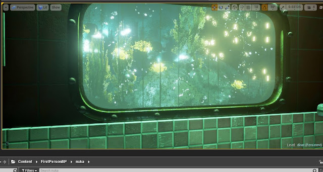
The lighting was definitely falling into place. You'll notice the materials looking off such as the wall. At this point I'd go back and modify it to match the lighting. Trial and error. I also added a landscape outside with some point lights scattered about to try and start to get the effect of a city off in the distance.


Worked on the glass shader slightly. I was trying to influence the roughness to make parts dirtier with no effect. I realised I should be changing the alpha channel and not the roughness. The glass was also a pain to try and match to Bioshock as reference because in Bioshock they had a sort of wibbly post process effect going on outside of which I'm yet to match in UE4.


I blocked in the bar and considered having the place flooding. But that took away from the lovely black and white tiles.


The doors were modeled next and were inspired straight from Bioshock. A spot light was added from above to give the door a sort of menacing feel.
My girlfriend noted that the windows looked kind of stupid without any trimming on them. So that was added next.


Trimming with rivets.

Regarding the materials not matching, the leather chairs weren't catching the light as expected. I realised they had little to no surface detail. I also added little fishes and seaweed planes outside. As well as rocks that were modeled quickly. I tried to recreate the wibbly wavy water effect (try saying that five times fast) by just turning up the refraction on the windows a lot.


New normals.


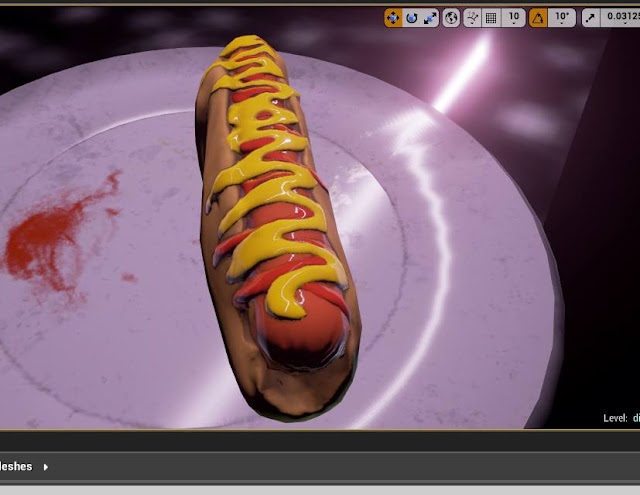
Once the bar was all set in place I needed a top part. I flipped the bottom part realising it would work and re-modeled it slightly to fit a light. Propulation (props & population) was the next step. What goods a diner without food.


I polypainted each section to that when it was retopologised I could colour ID match the corresponding parts easily.


After this I went on to set dress the entire level. The project was done to practice materials, lighting and hard surface modeling. Thank you for reading.




Friday, 11 December 2015

The Style Matrix-Final

The previous final entries for the style matrix will also be in this post in the form of links to save you the pleasure of scrolling down for a while to find them. The links take you to blogger as opposed to wix where the blog information is usually shown, so the formatting is a little weird. This post will also contain a few reflective words on all three of the projects on a whole and how they have helped influence what I will do for my final major project.

Project 1: Realist Helmeted Character.


Project 2: Stylised Shop Front.


Project 3: Epic City.


The style matrix projects are a  massive success. Not exclusively in the outcome but the projects themselves and the guidance they bring. These are the projects that help form what you want to do for your final major project, and possibly for the rest of your life. The first of my projects taught me how incredibly hard it is to make good looking character models. It just covers so many disciplines other than just art. You have to understand anatomy, materials, fabric-you have to know how to sew in some cases. Then all of the technical things like topology and UV packing. It's incredibly impressive. You basically have to understand why everything in the world looks like it does then replicate that. As a final major project direction, I don't think character art is for me. It's only recently when I've started to dabble. I'm not exactly good at it. And then the purpose of a final major project is to show off to anyone potentially hiring. There's little to no point in doing something I know nothing about. Also the character projects always seem very stale. They have in the past anyway. For final major projects people always make the cliche'd three characters and give me a degree. It all just seems very bland to me. My second project-so much fun. Hand painting textures are the bridge between 2D and 3D and it's the best thing ever. Hand painted stylised is something that's crept up on me. It's not something I've necessarily done a lot but it's something I know a lot about. I play only a handful of games but they're games that share this same art style. Even when growing up it's been a huge influence. Games like Fable, World of Warcraft. They've seeped into my brain and it's something I really enjoy. It's fresh to create because I've never made it, but not as difficult as expected because I'm accustomed to it. I am seriously considering using hand painted sylisation as a major influence on my final major project. Some sort of environment where everything is made by hand. Everything thought about individually with character and charm. It's something you don't see too often in regards to final major projects. People seem to lack creativity these days opting out for a simpler life of churning out wheelie bins all their life. Of course it's fine if you want to do that. I'm saying it isn't in my nature to want to do so. My final project, the city. It does tie in to my final major project, of course it does. If you want to make something original, you have to concept it. And the faster the production rate of concept the quicker you will make the actual project giving you more time to polish it. If I were to do an entire final major project on 2D concepting, I'd be bored by the second week. I'd lose interest and be unhappy with what I was doing. But if I concepted for a 3D project then actually made it in 3D; that's brilliant. It would alleviate the monotony of doing just one thing. And then even further down the line once you've finished modelling and unwrapping, you get to texture which is essentially just painting again. It's a loop and it's one that I enjoy. When I talk about the games I play the main event is League of Legends. The game is incredibly addictive transcending most games into it's own sport. It's crazy. And working behind this is some of the most impressive artists I've ever seen. Such brilliant art direction and technical ability. Working with these people would be a dream. I hop for my final major project I can produce something right up their alley and almost tailor it to them. Then be hired by them and live happily ever after.